Mesh Direct
Mesh Direct
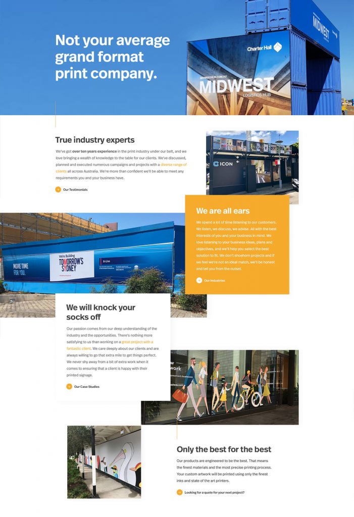
With Mesh Direct, we have an ample amount of information, educational videos and options available to help users make their decision or enquire more on the website. The problem they had was that their previous site came across as a static website, cluttered with multiple grids and large paragraphs.
With Mesh Direct’s revamp, our goal at Hello Pomelo is to simplify and relayout the content into sizeable portions, using infographics/ icons. Fine-tuning of user flow and to introduce interactivity to facilitate the user experience. Their brand new website serves as a platform to educate, advise and to highlight Mesh Direct’s experience in their field.
UI/UX · Web Design
Web Designer · Denise Koh


